In the rapidly developing world of cryptocurrencies, Knowledge is power. The ability to conduct your analysis and make informed decisions can be the difference between failure and success.
For new and professional cryptocurrency enthusiasts, Glassnode Charts from glassnode studio provides an extensive toolkit allowing them to dig deeply into market data and on-chain metrics.
Whether you’re trying to improve your trading technique, identify new trends, or gain a deeper understanding of the cryptocurrency ecosystem, Glassnode Charts provides the information you require.
This guide will walk you through various aspects of effectively using these charts from Glassnode Studio, empowering you to Spot Profitable Crypto Opportunities with Glass Node charts.
After reading this blog, you’ll be equipped to confidently navigate the crypto markets with the support of On-chain data-driven analysis.
Together, we will go through the fascinating Cryptocurrency world to enhance your analytical skills and decision-making talent.
Table of Contents
Understanding Crypto Analysis: Glassnode Charts From Glassnode Studio
By analyzing these Glassnode charts from the glass node, you will learn to interpret data from these four key metrics, enabling you to conduct extensive research and analysis. This knowledge could be particularly profitable if you are an investor. Following are some of the best charts from Glassnode studio to interpret the best data out of it.
- MVRV-Z Score
- Net Unrealized Profit/Loss (NUPL)
- Long-Term Holder Net Position Change
- Bull-Market Correction Drawdown

MVRV-Z Score
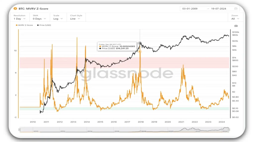
We know the ratio between market cap and realized cap as Market Value to Realized Value (MVRV). It tells us when the traded price is below or above a fair value. We can use the MVRV Z-Score to gauge whether Bitcoin is overvalued or undervalued compared to its historical investment patterns.
To understand this metric, we need to know it’s based on a formula comparing Bitcoin’s current market cap to its realized cap. The formula is the difference between these two values and is divided by the standard deviation of the market cap over time.
When we look at the chart from the glass node, we’ll see the MVRV Z-Score as an orange line and the realized price as a black line. We should pay attention to the red and green zones – the red zone suggests it’s time to take profits or sell, while the green zone indicates it’s time to buy, accumulate, or hold.
We can use this tool from the glass node to assess if Bitcoin’s current value aligns with its perceived fair value based on historical data. A higher MVRV Z-Score means the current market cap is significantly higher than the realized cap, suggesting potential overvaluation.
This often happens during market peaks or when prices are inflated compared to historical investment levels. If we’re investors, We might want to consider taking profits when the MVRV Z-Score enters the red zone.
Conversely, a lower MVRV Z-Score indicates the current market cap is closer to or below the realized cap. This could mean Bitcoin is undervalued or reasonably priced compared to historical standards.
When we notice the Z-Score entering the green area, it typically signals an accumulation phase in the market. This could be our cue to buy, accumulate, or hold onto our Bitcoin until the MVRV Z-Score moves back into the green zone.
Let’s look at the chart. We should have paid attention back in 2017 when Bitcoin hit $16,241. At that time, the MVRV Z-score was in the red zone, that was our signal to sell and lock in our profits.
Then, in 2018, when the price dropped to $3,800, we had a golden opportunity. The MVRV Z-score moved into the green zone, telling us it was the perfect time to buy more Bitcoin or start accumulating if we hadn’t already.
If we had bought then, we would have been well-positioned for the market’s next big move, as it reached new all-time highs after that period.
This situation often signals market bottoms or times when Bitcoin may be priced below its historical investment accumulation levels.
Disclaimer! MVRV is an aggregate measure and doesn’t reflect individual situations, it should be used in conjunction with other metrics from the glass node for a complete market analysis. You can access other metrics from Glassnode Studio.
Please note the calculations from MVRV use all the data from the beginning of Bitcoin’s history up to the present day. This cumulative approach helps give us a more complete picture of Bitcoin’s price behavior over its entire lifespan, rather than just a snapshot of recent activity.
BTC: Net Unrealized Profit/Loss (NUPL)
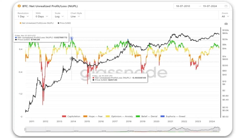
NUPL is a tool used to analyze the Bitcoin market. It helps us to identify potential market tops (when NUPL is very high), and spot potential buying opportunities (when NUPL is very low).
It also helps to understand overall market sentiment, analyze different investor behaviors (short-term vs long-term holders), and the the overall profit or loss situation across all Bitcoin holders.
Let us understand the Basic Concept of NPUL in simple words, for each Bitcoin that hasn’t been sold (called a UTXO), we can know the price at which it was last bought or received.
We compare this price to the current market price of Bitcoin. This difference is the “unrealized” profit or loss for that Bitcoin.
How to Calculate NPUL?
NUPL = (Market Cap – Realized Cap) / Market Cap
Whereas Market Cap is the total value of all Bitcoin at its current price and Realized Cap is the total value of all Bitcoin at the price they were last moved
How do we Interpret NPUL? Simply put, Positive NUPL means the Overall market is in a profit and Negative NUPL means the Overall market is in a loss, so the magnitude of NUPL indicates how much profit or loss exists.
The color-grading shows the Market Sentiment on the chart such as
Deep Red means very negative, Capitulation, and maximum fear.
Orange color denotes Fear to go further down or hope to pull back.
Yellow denotes optimism to trend up or down, or anxiety whether it trends up or down.
Green denotes in belief or denial of further trends,
Blue means Euphoria is greed when people are buying in a belief to go up, that could be the potential market top and market reversal.
How to use NPUL? We can use NUPL for various purposes, such as identifying potential market tops or buying opportunities, understanding overall market sentiment, and analyzing different investor behaviors.
NUPL tends to follow Bitcoin’s market cycles, Bottoms out during bear markets (lots of unrealized losses), and Peaks during bull markets (lots of unrealized profits) whereas Large swings in NUPL can indicate concentrations of supply at certain price points.
Let’s look at what happened with Bitcoin on November 22, 2013. On that day, the NUPL (Net Unrealized Profit and Loss) was shown in blue on the chart from glassnode studio. This blue color meant the market was overbought and people were very excited.
The price of Bitcoin was $746, and the NUPL value was 0.82, which is positive. This was a good time to sell our Bitcoin and take our profits.
After this peak, Bitcoin’s price fell to $207, the NUPL color changed to red, and its value became -0.49. The red color tells us that the market had reached a point of extreme fear or “capitulation.”
This means many people were giving up and selling their Bitcoin at a loss. However, this was a great time for us to buy more Bitcoin. When everyone else is scared and selling, it is often a good time to buy Bitcoin.
Remember, these points in the market – in the Blue region (i.e.: when everyone is either too excited) and green (greed or belief) or in Red (too scared) and Orange (Fear of going down or hope of going up). They can be good indicators of when to sell or buy.
You must always have some funds for Dollar Cost Averaging when the market is in the Red or Orange regions,
Similarly, you must book some profit when the market is in the Blue or Green regions. Always be careful and do your research before making any investment decisions.
Disclaimer! NUPL is an aggregate measure and doesn’t reflect individual situations, it should be used in conjunction with other metrics from Glassnode Studio for a complete market analysis
By studying NUPL and its variants, investors can gain insights into market-wide profit/loss situations, potential turning points in market cycles, and the behaviors of different Bitcoin holders. This can help you make more informed decisions for investment.
Long-Term Holder Net Position Change
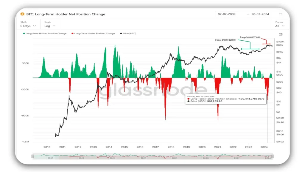
This chart shows us how long-term Bitcoin holders (those keeping Bitcoin for over 155 days) change their positions over time. It’s a key tool to understand market sentiment and predict future price movements. We should know that major market moves depend on these long-term holders when they switch from holding to selling, or vice versa.
Let’s look at the chart components: Green bars show when long-term holders buying more Bitcoin. Red bars indicate when they’re selling. The black line tracks Bitcoin’s price over time.
When we see green bars above the centerline, it means long-term holders are increasing their Bitcoin stash. This often hints at their confidence in future price hikes.
We’ll notice large green areas often come before big price jumps. It suggests experienced investors are buying before a potential bull run – that’s the accumulation phase we’re seeing.
Red bars below the centerline? That’s when long-term holders are selling. They might be taking profits or losing confidence. We’ll spot red areas near price peaks, showing these holders are selling when prices are high – that’s the distribution phase.
From August 2022 to September 2023, long-term holders bought Bitcoin when prices were between $15,000 and $26,000. Then, from December 2023 to May 2024, they started changing positions.
The back-and-forth between green and red helps us identify different market cycle phases. It’s our indicator for spotting market cycle changes.
Long stretches of green? That could signal a building bull market. When it switches to red after a price increase, we might be at the start of a bear market or a market reversal.
Let’s pay attention to the size of the bars too. Taller bars mean bigger position changes – more significant buying or selling events.
We can compare current market conditions to historical trends by studying these past trends. This chart gives us a window into Bitcoin’s major accumulation and distribution events throughout history.
We might use this to gauge overall market sentiment and potential trend changes and we might also use it to time entry and exit points for long-term positions.
The chart from the glass node reflects the psychology of experienced Bitcoin holders, often considered the “smart money” in the market. Their behavior can predict broader market movements.
This chart from Glass Node is a powerful tool for understanding the behavior of seasoned Bitcoin investors. Market participants can gain valuable insights into potential future trends and market sentiment in the Bitcoin ecosystem, by analyzing the patterns of accumulation and distribution, along with their correlation to price movements,
Disclaimer! This metric doesn’t capture the behavior of all market participants, only long-term holders. It’s a lagging indicator, as it takes time for holders to be classified as “long-term” and it should be used in conjunction with other indicators for a comprehensive market analysis.
Bull-Market Correction Drawdown
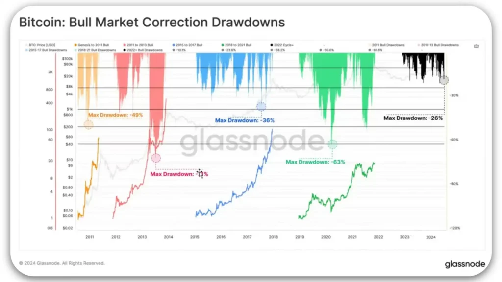
The chart provides a historical perspective on Bitcoin’s price movements and drawdowns over various cycles. A drawdown represents the percentage decline from the highest price reached before recovering. For instance, in the first few cycles of Bitcoin’s existence, we observe significant drawdowns: -49%, -71%, -36%, and -63%.
These figures illustrate the market’s volatility and the extent of price declines during those periods.
In July 2024, the market is experiencing a -26% drawdown, the market is resilient to more corrective moves because of ETF-approval. This drawdown unfolded as Bitcoin initially reached highs around 71,600 and then declined to approximately 53,000.
Such corrections are common in Bitcoin’s volatile market, often fluctuating around plus or minus 10%, which affects short-term traders and investors adjusting their strategies based on market movements.
Comparing the current cycle to previous ones, notably the 2015-2016 cycle, reveals similarities in market behavior. In both cases, Bitcoin achieved record highs before Halving events.
Following these peaks, the market entered a phase characterized by price consolidation and a lack of clear trend direction, known as range.
In conclusion, the chart provides insights into Bitcoin’s historical performance and helps us gauge the current market conditions and potential trends based on past cycles.
Understanding these patterns can inform decision-making strategies for participants in the cryptocurrency market.
Conclusion
These are the Glassnode charts from Glassnode studio that many renowned crypto analysts rely on for on-chain analysis, providing us with invaluable market insights. Our goal is to empower you, our readers, to dive into these charts, interpret the data yourselves, and make informed decisions backed by your valuable research.
As we’ve explored, understanding and interpreting Bitcoin’s on-chain data through Glassnode charts can significantly enhance our decision-making capabilities in the crypto market. These charts provide us with insights into market sentiment, investor behavior, and potential future price movements by analyzing various metrics like MVRV Z-Score, NUPL, and Long-Term Holder Net Position Change.
By studying historical trends and current data, we can better identify optimal times to buy, hold, or sell our assets. The ability to recognize patterns in market cycles and investor behavior empowers us to make informed, strategic decisions, reducing the risk associated with market volatility.
The journey to mastering these tools is both enlightening and rewarding. As we refine our analytical skills, we become more adept at navigating the complexities of the cryptocurrency landscape. Leveraging the power of Glassnode charts helps us spot profitable opportunities and fosters a deeper understanding of the market dynamics.
Ultimately, taking the time to read these charts and conduct our analysis will be beneficial. By becoming proficient in these techniques, we can transform ourselves into expert crypto analysts, ready to capitalize on the opportunities presented by this dynamic and exciting market.
Discover the ultimate edge in crypto trading with Glass Node. Their premium charts and on-chain analysis deliver invaluable insights that enhance knowledge and boost earnings.
True wisdom comes with a price; the best insights are rarely free if you want to access these op-tier charts and on-chain analysis, subscribe at a very affordable rate through the following link that will revolutionize your trading strategy.
Please subscribe for the latest research, diverse chart analysis, and tool insights. If you enjoyed our blog, please share it on these platforms—sharing is caring!
Affiliate Disclosure
This post may contain affiliate links, which means we may earn a commission if you make a purchase or sign up through these links—at no additional cost. We only recommend products or services that align with our values and are relevant to our readers. These commissions help us maintain the quality content on Pro2Crypto and support our mission of providing trustworthy insights into cryptocurrency, blockchain, and DeFi. We appreciate your support!
FAQs
How to Analyze Bitcoin’s On-Chain Data with Glassnode Charts?
You can identify the best times to buy and sell cryptocurrencies by analyzing on-chain data and market trends. Different charts like NUPL, MVRV-Z score, etc. provide broader market aspects. Please read this blog to learn, How to analyze the On-Chain data charts:
What is Glassnode?
Glass Node is a platform that provides data and charts to help you analyze Bitcoin and other cryptocurrencies. You can access and work on charts from Glassnode Studio.
What does the MVRV stand for?
MVRV stands for Market Value to Realized Value. It is a ratio used to assess whether Bitcoin (or another cryptocurrency) is overvalued or undervalued by comparing its current market capitalization to its realized capitalization.
What does the MVRV-Z Score tell me?
The MVRV-Z Score indicates if Bitcoin is overvalued or undervalued, based on historical data. Red zones suggest selling and green zones suggest buying.
How do I start using Glassnode charts from Glassnode Studio?
Learn the basics from the range of blogs exploring our website. We’ll keep posting advanced content for your learning, and for updated charts explore the charts on the Glass Node website, consider subscribing to Glassnode for more updated data.
How can I use Glassnode charts to improve my trading strategy?
Use the data from different charts explained in this blog, to spot trends and make informed decisions about when to buy and sell cryptocurrencies.


Blockchain integration in business